This exercise really got me looking at book covers - the design, style of illustration, typography used etc and is an area I'm really interested in . I looked at classic penguin novels, modern contemporary fiction, kids books, and very text based illustration by Jonathan Gray.
I came across these redesigned covers illustrated with embroidery for the Secret Garden and decided to strip it back to the initial stages of the cover design and sketched out the outline of the image. (note the image below is the full image - whereas some covers only feature part of this image).
 sewn by Jillian Tamaki
Online image, Accessed by http://tundrablog.com/2011/03/29/jillian-tamaki-penguin-threads-deluxe-classics/tamaki_sg/ - October 10th 2012
I can imagine the brief for the illustrations was to update a modern classic in a quirky and unusual way and I like the almost dreamlike quality of it a bit like Alice in Wonderland style.


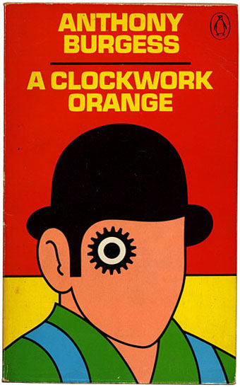
Very simple yet almost surreal - use of visual metaphor. Bold colour choice - shapes almost childlike.

Very simple yet effective lets the book speak for itself.

Mikey burton illustrations - Rest, read relax series. Online Image - Available from http://faceoutbooks.com/#Rest-Relax-Read-Series, Accesssed 10th October 2012
These illustrations are particularly quirky and are a modern take on the classic novels with something slightly disturbing about them. Use of unusual fonts and almost haunting imagery. I can imagine the brief was to draw new readers to the classic novels.
I also produced/ enlarged some book covers by Mikey Burton as part of a penguin classics series. I tried to just show the main lines of the images.


Use of visual metaphor quirky interesting, grabs attention. I can imagine the brief was to represent the unusual title in a modern quirky way.

Online image: http://faceoutbooks.com/#The-Girl-Who-Ate-Kalamazoo

Judith Kerr - The Tiger who came to Tea - Online Image Available http://www.bambinogoodies.co.uk/va-exhibition-goodies-the-tiger-who-came-to-tea/ Accessed 11th October 2012


I also tried a few more examples including the "Tiger who came to Tea" by Judith Kerr. I tried a more detailed line visual and then a few days later tried to strip this back even further and concentrate on the main outline/shapes. I think the image I've created is honest to the original source and the stripped back version shows the main elements of the artwork.
This was a useful exercise at getting me thinking about the main features of a design and how its good to imagine how the final piece will look and gives you a good opportunity to think about whether the composition works prior to colour choice.
Images found that make me think about art direction . The reworking of the classic penguin horror series by Coralie Bickford-Smith . Very bold striking images almost haunting created using cyan blue prints. Simple fonts are very effective. I've been looking at the Penguin book blog online and it shows a short video where Coralie explains her use of cyanotype to produce the images as she wanted something modern and striking to stand out on the book tables.


Online images available from http://nytimesbooks.blogspot.co.uk/2008/10/penguin-horror-series.html
Accessed 7th November 2012.
I also particular was drawn to Coraline's work in the Penguin cloth bound classic series where she produced a range of covers .


The covers are based on patterns that all conform to the same grid bringing a recognisable style across the range of books but allowing each book to convey something about the character of the individual books. Each of the patterns reflects something about the book content with some being more literal than others. I love the simplicity yet boldness of these designs - simple outlines which really stand out and are quite symbolic.
Online images available from http://nytimesbooks.blogspot.co.uk/2008/10/penguin-horror-series.html
Accessed 7th November 2012.
I also particular was drawn to Coraline's work in the Penguin cloth bound classic series where she produced a range of covers .
The covers are based on patterns that all conform to the same grid bringing a recognisable style across the range of books but allowing each book to convey something about the character of the individual books. Each of the patterns reflects something about the book content with some being more literal than others. I love the simplicity yet boldness of these designs - simple outlines which really stand out and are quite symbolic.


