For guilty secret I had a few ideas namely of someone having a guilty stash of foods/ treats etc perhaps they're meant to be on a diet and the still life could be based around empty packets perhaps shown as hidden in some way or lots of sweets and packaging.
The other idea was a woman buying lots of things like shoes and bags some all matching and maybe having the price tags showing.
My friend is a real shopaholic so she was kind enough to let me set up some still life's and then photograph some of her items in various compositions


I also set up some packaging and treat food compositions and shot them from different angles/ positions.


Based on feedback from my last jazz assignment I know I found it very difficult to be decisive in terms of a final composition and what elements to include in my poster. My tutor suggested in the feedback that I be more decisive at the composition stage and work with thumbnails etc to decide the elements I want in my image. With that in mind I produced a lot of thumbnails based on both interpretations of the Guilty Secret topic and was constantly thinking about suitable angles and viewpoints to represent the theme and the subject choice.
I decided to go with the food idea and worked on different thumbnails in my sketchbook.
At this stage I considered different angles and compositions thinking about the size and positioning of the different products for emphasis.


I then began to think about how best to illustrate. I think this is where I'm needing some pointers and I hope that some input from my tutor once I'm finished can help my direction. The brief wanted an observational drawing so I set about trying to be reasonably accurate in my interpretation of the still life. That being said I don't know there was something I felt just wasn't right and really amateur like about my drawing so I also considered doing something slightly looser illustrations and tried painting with my paintbrush.
Looking at the brief and deciding that I wanted to illustrated food / packaging and given that the brief was for an editorial I went back to look at some of the food illustrations I had come across for Assignment 2. I really like the work of Emily Jayne Robertson who has produced editorial illustrations for publications including the Sunday Telegraph and Spectator Life and a range of food illustrations for M&S.


Emily Robertson Online Images Accessed via http://www.emilyjaynerobertson.com/filter/Food/Spectator-Life-Magazine, Accessed 25th January 2013
Although the brief in hand was to be technically accurate I wanted to see if I could capture a looser interpretation of my subject. I tried some direct paintings of the food packaging but felt they looked really too amateurish and child like and needed further refinement.
I remembered when at school I had created a collage still life and included some sweet wrappers in this looser illustration. I really was quite stumped at this point though. On one hand I felt I was getting something across quickly and each of the products was identifiable. The vivid colour of the wrappers really stood out but as the actual shape of some elements eg eclipses etc wasn't accurate due to the speed and style I thought - does this look like something a child could produce? I really like a lot of simple almost child like work but what distinguishes something which just is a poorly observed piece and something which communicates simply and effectively.

I then had a think about it and looked at some other illustrators work more closely and figured that the crucial point was in the delicate line work whereas mine was too clumpy with too much block colour.
I went back and had another go at some more linear based work which I think was slightly more successful. I'd really be curious as to my tutors option on some of these and what elements make something like this successful/ unsuccessful.
 |
| looser direct paintbrush style |
At this point I decided to shelf this looser style idea and work on a more direct observational composition.
From my sketchbook and photographs I produced a linear drawing with a selection of the packaging.
 |
| linear composition |
The next stage asked us to produce a tonal version of the piece. I copied my linear piece and added colour and tone with colour pencil. The colours were very much i line with the original colour of the items but I felt that the bright and vivid nature and use of red showed the almost danger like quality of the food.
I then decided to work with some variations of this in Photoshop and I tried some different filters, crops and colour schemes including an invert colour scheme which brought out some more green tones in the piece which I thought also represented the guilty aspect of the illustration topic.


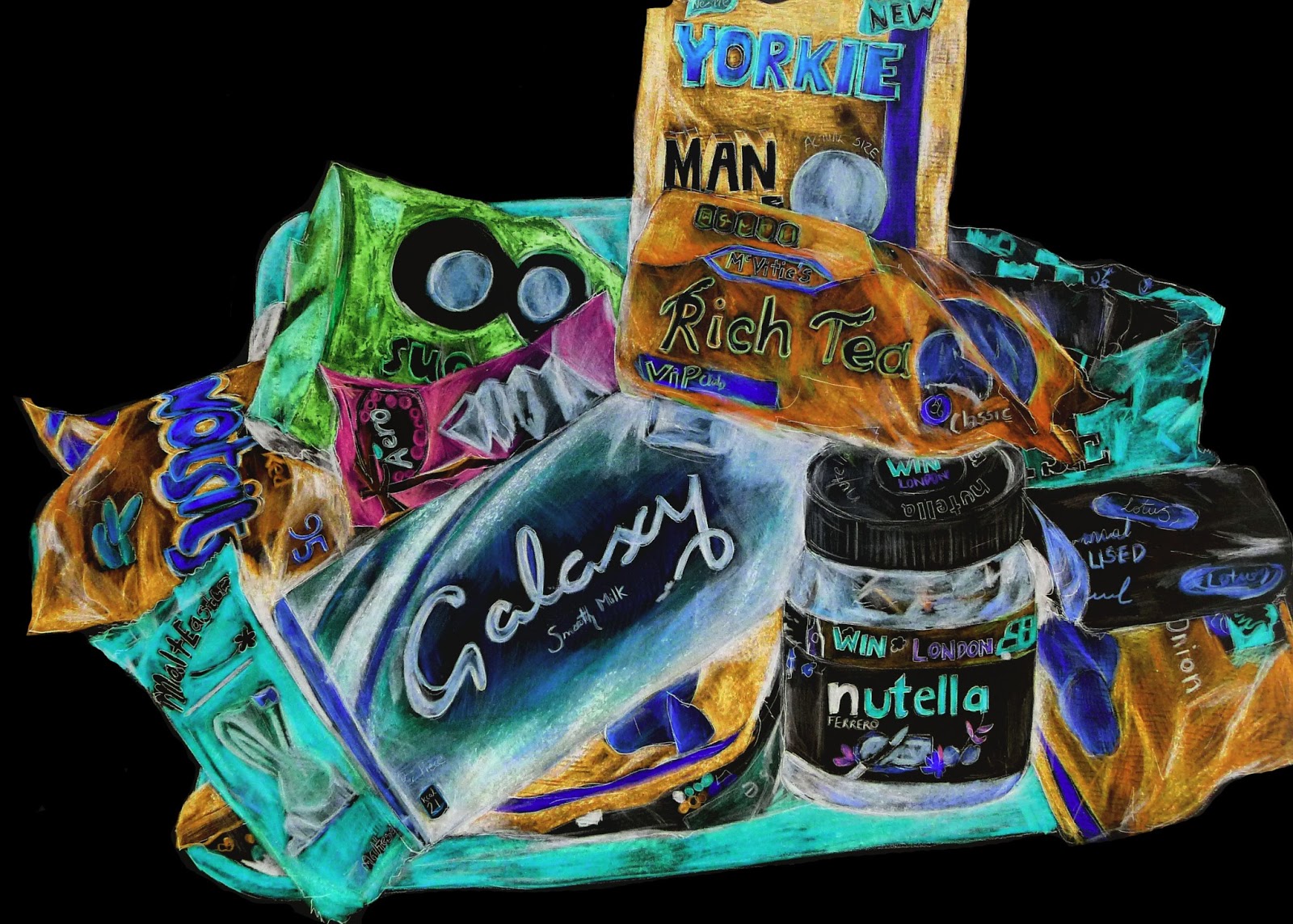 |
| invert - almost like an x-ray - luminous neons look quite scary - reinforces guilty aspect. |

The next stage involved developing your illustration further and introducing other elements or character if appropriate.
I went back to some sketchbook work and thought that introducing a woman almost shielding the food could portray the theme. I considered having her in from of the cupboard and tried to get her stance right so it looked like she was concealing the items in a cupboard.
I think there was some merit in this idea and when I tried to crop the composition I thought it looked stronger.


 |
| tighter crop |

 |
| rotated crop |

 |
| a red danger tint to the composition |
experimented with women wasn't convinced
More photoshop experiments with different compositions joined together in a cupboard illustration.


Final
After these experimentations I wasn't totally convinced with the women being in the final image but liked the idea of the items being in a cupboard with a lock and being really big and filling the frame.
I then produced a linear visual based on this idea and took it through to a final illustration with cross hatching and colour pencil. The choose red for the biscuit tin to emphasis the guilty aspect and draw attention and the tones in the foods I selected create quite a pleasing colour palette - a few dominate colours with accents of another few colours.


Poster effect Final idea

Again, I tried an invert which I think looks quite effective.

Adding the illustrations to sample magazine articles.
 |
| Earlier illusration |

Final artwork
