Monday 13 May 2013

Exercise - Educational Strip

For this exercise we were asked to create an strip style illustration to be used in schools to help teenagers cope with the onset of puberty.

I chose to focus on what happens to girls during puberty and set about brainstorming some ideas.

As suggested I wanted the images to be quite humorous yet was conscious I didn't want to down play the emotions that can be felt at puberty. I began with some ideas in my sketchbook thinking a girl being alarmed by the changes in her body - looking in the mirror at herself - her curves, imagining that everyone know shes got her period / is carrying a sign..
I was trying to think about how accurate I should make the character given that the piece was very body orientated and tried out various character like simplistic styles and more realistic looking shapes.

I thought about the main things that happen around this time which are difficult to deal with - periods, getting more shape - hips , boobs and curves, mood swings, spots.

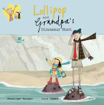
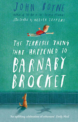
I looked at the work of Oliver Jeffers and love his almost stick like representations which still manage to convey emotion and humour and his work is used across a variety of disciplines from adverts to kids books.

Tom Gauld is another illustrator who creates some very quirky illustrations for campaigns including for Boots the chemist. Again, I love his simple character representations which convey very real life emotions.

I also looked at Hannah Warren whose work really creates a story with strong characters and narratives using mainly digital processes. On the other hand Tim Kirby creates humorous strips but tends to use more hand-drawn characters.


What's going on type image - simple line drawing


Changes in emotions, body shape, support from a friend


Considering stick style drawings with some shape or more realistic characters


I decided on some linear drawings with minimal colour and picked out the drawings which would sum up the changes which occur and selected a shrugging shoulder girl for the front cover image.
The last image tries to show that with support of friends/ family and a bra that things will be okay.


Front image


I decided to make my image into a strip style illustration which I thought could perhaps become a folded concertina like leaflet with the "What's happening to my body - its all gone mad!" being the front fold. 

Click for full size


Other styles/ ideas


Just to experiment I also considered using more basic figures as an illustration but for the desired audience I think the strip illustration above is appropriate.

I'm reasonable happy with this illustration and think it gets the message across without being too complicated to understand. I've added a few words for effect but these could be excluded easily.
I'm happy with the simple colour choice but there are opportunities for more variation and Photoshop effects/ backgrounds etc should the client require.


Update after tutor report feedback

The feedback from my tutor for this exercise suggested that I could combine the spots and mood swings image and perhaps finish the strip on a positive note with a confident blooming young lady. This seemed like a good idea and I think it would assist in meeting the brief which was all about how to cope with puberty. 

Happy sorted teenager!


She also suggested that for the "Periods" image I could consider look at alluding to the huge choice of sanitary protection available and perhaps consider looking at surface pattern for teenage girls. or using a background pattern . I looked at some teenage bedrooms for pattern ideas from some magazines. 


I thought perhaps using something that alluding to the crazy time that is puberty would be appropriate so I considered a zig zag pattern and spots in girly pink shades. However, I was conscious I didn't want to overwhelm my images with pattern. 

I experimented adding a pink dot patterns and a flower pattern and quite liked how it almost looked like something you would get on some of the female products designed for puberty! I experimented with different opacities and scales of pattern - trying not to overwhelm the illustrations and I think the overall look is quite appealing. I decided to change the font to make it stand out more against the backdrop. 


Overall after the tweaks I'm actually a lot happier with this image and it was good to revisit if after the feedback. I think finishing the illustration on a positive note also works better and the background texture whilst quite prominent is appropriate for the market. 


Sunday 5 May 2013

Exercise - Working for children


The first part of the exercise involved gathering examples of work for children and grouping these according to there suitability for different age groups.

Pre- reader


Pre- school 3 -5 


Lunchtime


The Dark by Lemony Snicket, Jon Klassen


The Black Rabbit by Philippa Leathers


My own book - loved this as a kid!


Early reader (5 - 7)

Black Dog by Levi Pinfold


Lollipop and Grandpa's Dinosaur Hunt by Penelope Harper


Established reader (7 - 9)


The Terrible Thing That Happened to Barnaby Brocket by John Boyne


Older readers


Summer's Dream by Cathy Cassidy

The Weight of Water by Sarah Crossan


Liar and Spy by Rebecca Stead


Age brackets for children aren't clear cut  I think theres a fair amount of overlap - some books I think have something all children and indeed adults can appeal to certainly when you think of books by Allen Alhberg or Quentin Blake or The Gruffalo ( I know my friends kids both love this book - one who is only one year old the other nearly five. Certainly, I spent quite a bit of time looking at different book sites and a lot seem to classify them as being suitable for a certain year and over.

In terms of illustration the amount of different styles of illustrated childrens books is immense ranging from simple drawings to more elaborate full scale scenes. Colour wise I certainly don't think children s books need to always be brightly coloured. For example, looking at books by Lemony Snicket which have story's which are slightly scarier the use of dark colours are more appropriate for example in the book "The Dark" illustrated by Jon Klassen.

The next part asked us to select two of the age groups then select two from a choice of themes and create an animal character portraying the theme.
I did some brainstorming and experimentation with different characters and highlighted words which most appealed.
Ideas included Festival - thinking about colours, fairground rides, balloons,
Growing - growing up - plants growing, growth chart, being scared of growing
Family - love, generations
Journey - travel, packing your bags, suitcase
Scary - scared of the dark, ghosts, monsters in your room

I experimented with characters including bears, pigs, penguins and owls but was most drawn to the bears and penguin characters. I tried different styles of each animal looking at shapes and placement/ complexity of facial features.

I decided on Pre- school and early reader as suitable targets.


Growing bears, penguin on a journey


Bears scared of monsters

Owl scared of dark, penguin raving at a festival


Growing bears

A bear scared by another mini bear with sheet - irony?

Penguin on a journey who ends up at the festival combining the themes. I tried a watercolour, ink and crayon version of this idea. Then I used Photoshop and tried a collage cutting out bits of fabric.


Cut out leather fabric for penguin, felt backpack

Favourite penguin image - Early reader 5-7 


Collage roof - not so sure about this one


Not so sure about the compositions with these ones but in looking at other illustrations compositions for kids don't really need to be accurate to get the message across.


Pre- school image bear in bed 


Black and white version - trying to think about it being nightime when the big monster appears


Pre- school image - growing bears
Pre - school growing bears image 

Overall I enjoyed this exercise and the process of creating characters. I think each of the images I've created would be suitable for children aged between about 3 - 5 and be relevant to there feelings about Growing, Scary things and going on a journey.
I struggled a bit with the bear in the bed image to get the monster looking good with shadow etc and looking at some other work by people like Jon Klassen and  In the Dark show that this can be achieved very successfully but I know that these subtleties and abilities in illustration can hopefully be developed in my work with time and practice/ experimentation.

Update after tutor report
After receiving my feedback on this exercise I reappraised the age ranges I selected, and think the bear image is in fact more suitable for early reader and the penguin images more suitable for the pre- school age range.

Change to early reader 5 -7


Pre school image